- SWING Tutorial
- SWING - Home
- SWING - Overview
- SWING - Environment
- SWING - Controls
- SWING - Event Handling
- SWING - Event Classes
- SWING - Event Listeners
- SWING - Event Adapters
- SWING - Layouts
- SWING - Menu
- SWING - Containers
- SWING Useful Resources
- SWING - Quick Guide
- SWING - Useful Resources
- SWING - Discussion
- Selected Reading
- UPSC IAS Exams Notes
- Developer's Best Practices
- Questions and Answers
- Effective Resume Writing
- HR Interview Questions
- Computer Glossary
- Who is Who
SWING - Controls
Every user interface considers the following three main aspects −
UI Elements − These are the core visual elements the user eventually sees and interacts with. GWT provides a huge list of widely used and common elements varying from basic to complex, which we will cover in this tutorial.
Layouts − They define how UI elements should be organized on the screen and provide a final look and feel to the GUI (Graphical User Interface). This part will be covered in the Layout chapter.
Behavior − These are the events which occur when the user interacts with UI elements. This part will be covered in the Event Handling chapter.
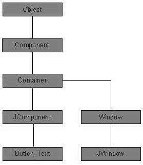
Every SWING controls inherits properties from the following Component class hiearchy.
| S.No. | Class & Description |
|---|---|
| 1 | Component
A Component is the abstract base class for the non menu user-interface controls of SWING. Component represents an object with graphical representation |
| 2 | Container
A Container is a component that can contain other SWING components |
| 3 | JComponent
A JComponent is a base class for all SWING UI components. In order to use a SWING component that inherits from JComponent, the component must be in a containment hierarchy whose root is a top-level SWING container |
SWING UI Elements
Following is the list of commonly used controls while designing GUI using SWING.
| S.No. | Class & Description |
|---|---|
| 1 | JLabel
A JLabel object is a component for placing text in a container. |
| 2 | JButton
This class creates a labeled button. |
| 3 | JColorChooser
A JColorChooser provides a pane of controls designed to allow a user to manipulate and select a color. |
| 4 | JCheck Box
A JCheckBox is a graphical component that can be in either an on (true) or off (false) state. |
| 5 | JRadioButton
The JRadioButton class is a graphical component that can be in either an on (true) or off (false) state. in a group. |
| 6 | JList
A JList component presents the user with a scrolling list of text items. |
| 7 | JComboBox
A JComboBox component presents the user with a to show up menu of choices. |
| 8 | JTextField
A JTextField object is a text component that allows for the editing of a single line of text. |
| 9 | JPasswordField
A JPasswordField object is a text component specialized for password entry. |
| 10 | JTextArea
A JTextArea object is a text component that allows editing of a multiple lines of text. |
| 11 | ImageIcon
A ImageIcon control is an implementation of the Icon interface that paints Icons from Images |
| 12 | JScrollbar
A Scrollbar control represents a scroll bar component in order to enable the user to select from range of values. |
| 13 | JOptionPane
JOptionPane provides set of standard dialog boxes that prompt users for a value or informs them of something. |
| 14 | JFileChooser
A JFileChooser control represents a dialog window from which the user can select a file. |
| 15 | JProgressBar
As the task progresses towards completion, the progress bar displays the task's percentage of completion. |
| 16 | JSlider
A JSlider lets the user graphically select a value by sliding a knob within a bounded interval. |
| 17 | JSpinner
A JSpinner is a single line input field that lets the user select a number or an object value from an ordered sequence. |